

When we think of Nigerian weddings, we think of bright and colourful! Your colour palette is reflected in most details of your wedding - the decor, your traditional attire and sometimes even your cake. That’s the easy part! The hard part is picking your colour palette, and that’s why we are sharing the below tips to help.
Read till the end where we share a free tool (or two) to help you in picking the hues of your dream!
1. Your wedding setting: how do you plan to incorporate these colours into the wedding - venue decoration, invitations, attires? For some aspects of the wedding, the colour choice will be a small detail (eg wedding invitation) and for others, it’s a bolder statement (eg venue decoration). My guess is that you’d probably care about how the colours play in some settings vs others. If so, prioritisation could help and ensure that the colour palette is incorporated where it matters the most. Visualisation also goes a long way here!
2. Think beyond your favourite colours: one of my favourite colours is black but I’m not quite sure I want that to be incorporated into my wedding decor! Don’t be afraid of looking beyond your go-to colours. Blogs, Instagram, magazines are good for drawing inspiration and bringing your attention to an array of colours/ colour combinations. That said, definitely pick colours you actually like for your big day!
3. Choose easily incorporable colours: when picking your palette, choose colours that will be easy to work with. You may find yourself in tricky waters if your venue decorator and other vendors are struggling to find items that match your colour scheme. The last thing you want is to settle for other colours and end up with a not so interesting colour combination
4. Check-in with others: if the opinions of certain people matter, you could check-in with these people to ensure they have no strong (negative) feelings against your choice. However, you want to be careful on how many opinions you seek on this matter (remember the saying about too many cooks in the kitchen) - focus on the people who matter the most!
5. Find inspiration in what you love: struggling with inspiration, why not look into the things you love! Your favourite city, your favourite beach, your favourite art piece. Very soon, we share a tool which can help you extract colour schemes from pictures of your favourite things!
Now, time for the bonus tips!
Well, great to see you here - you’ve (hopefully) read and found the above tips useful. For these bonus tips, we’re going digital - we find joy in sharing tips and tools that take the stress away from you.
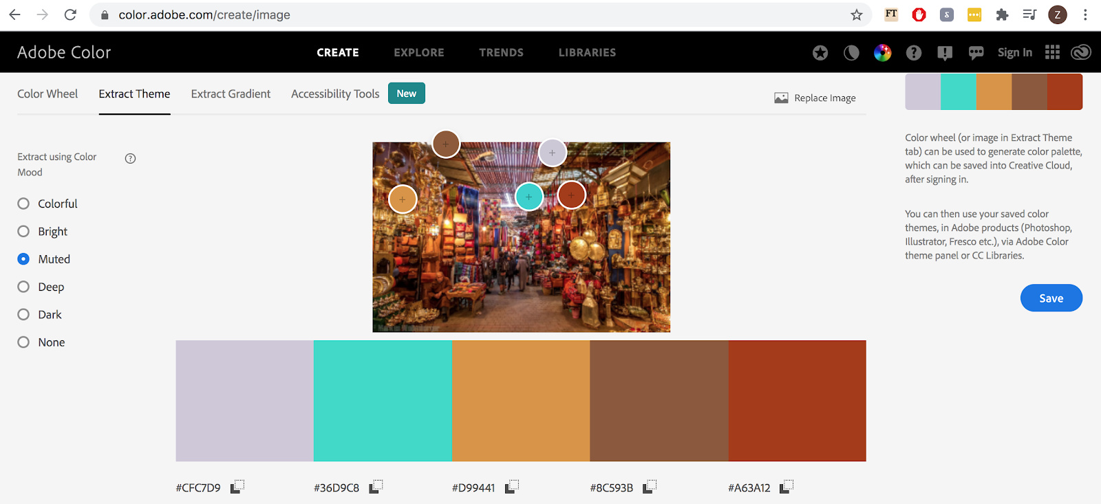
Tool 1: Adobe Colour
Adobe Colour is a fantastic tool that extracts colour themes from your images. The tool offers six different colour moods (colorful, bright, muted, deep, dark and none) and will select different colours from the same image against your preferred mood.
Below is an inspiration using a picture of a Marrakech market (I would like to visit Morocco one day!)
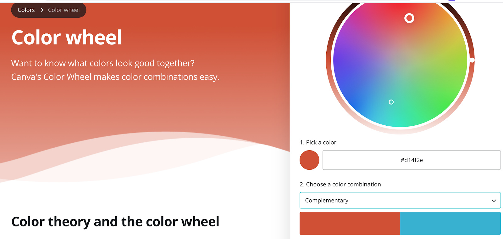
Tool 2: Canva Color Wheel
Canva is definitely one of my favorite tools for being creative. They have an interesting feature called Color Wheel which helps you find colours that look good together. This is helpful if you have a main colour and are trying to find other colours that work with this or if you are completely stuck at what scheme to choose. The tool offers five colour combination choices - complementary, monochromatic, analogous, triadic and tetradic.
Here’s what it looks like in action!
I hope these tips have been helpful, whether you’re deep into your planning process, recently engaged or a curious singleton. We’re keen to hear top tips on how to plan best and stress less - leave a comment and let’s get chatting.